PROJECT DETAILS
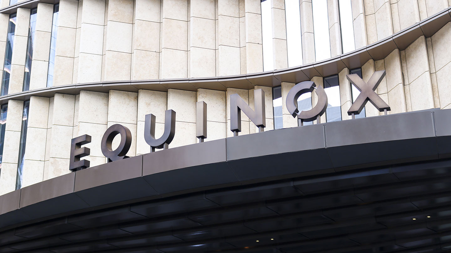
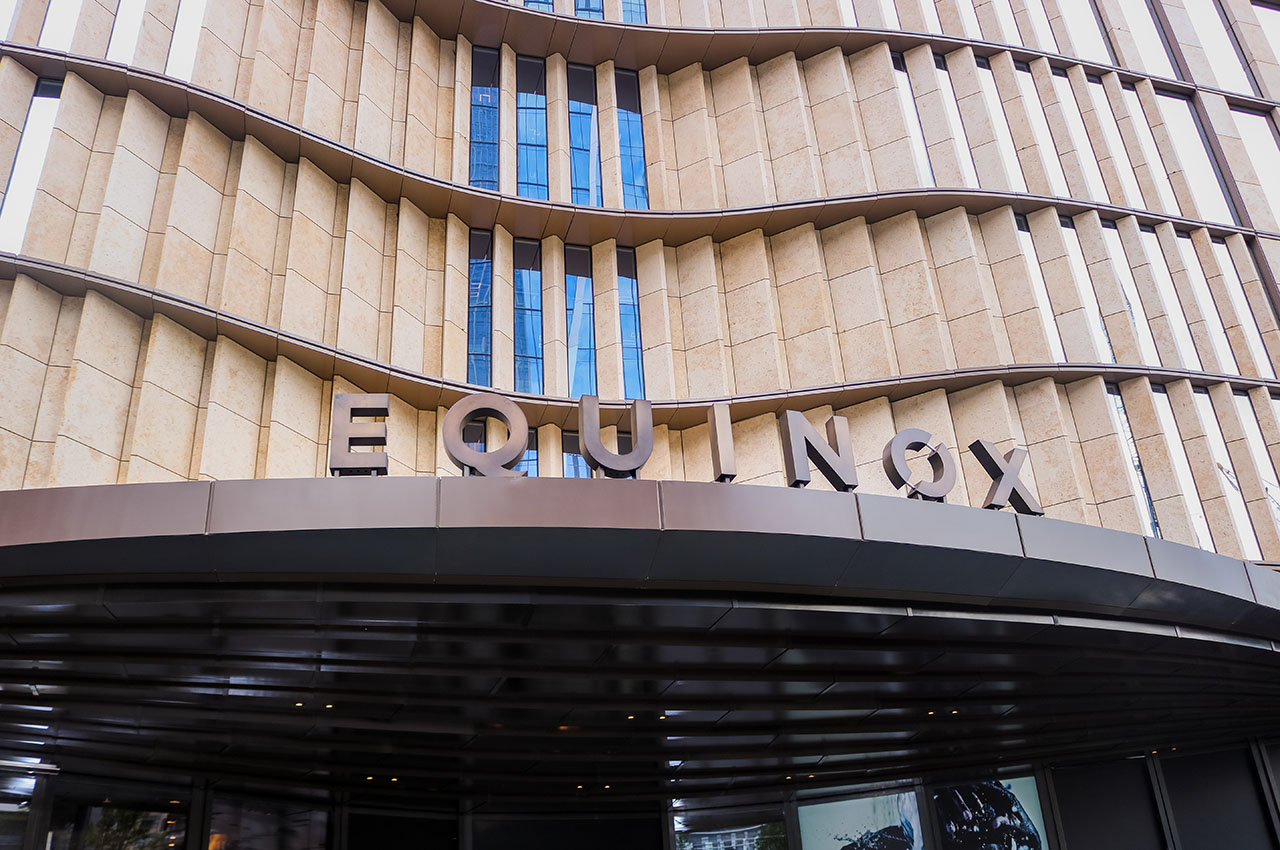
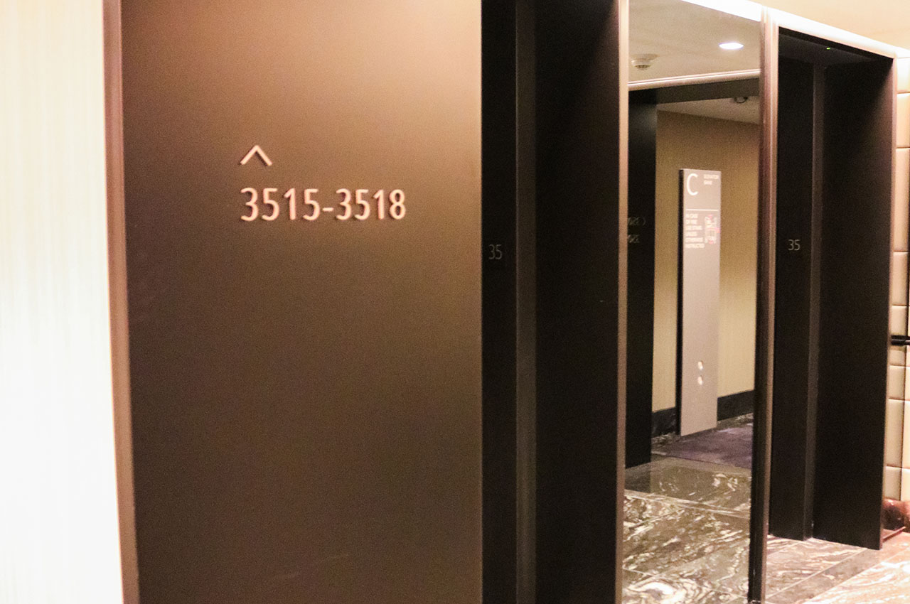
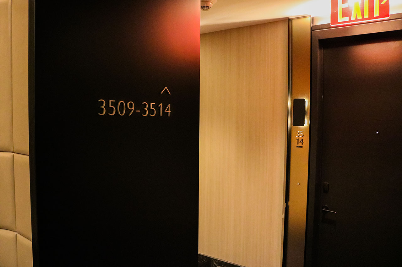
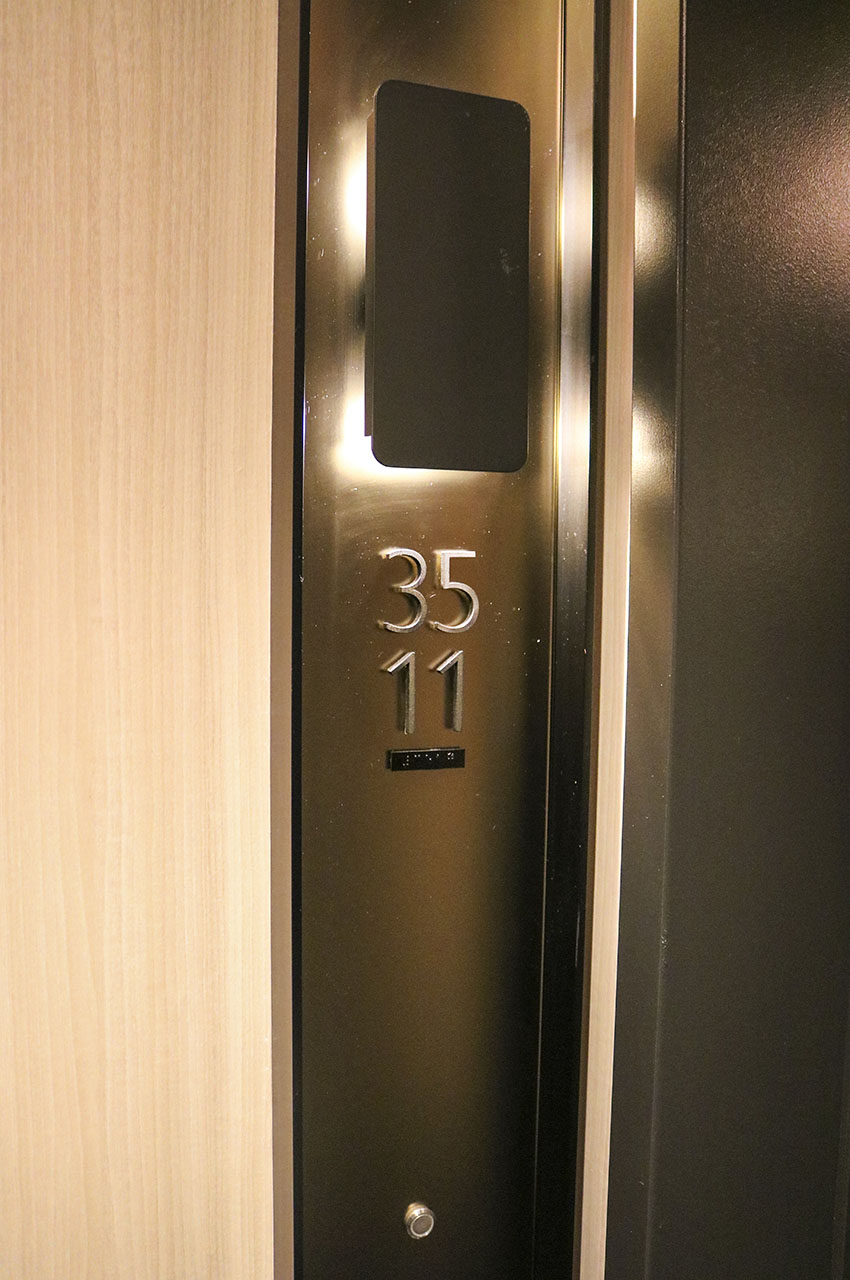
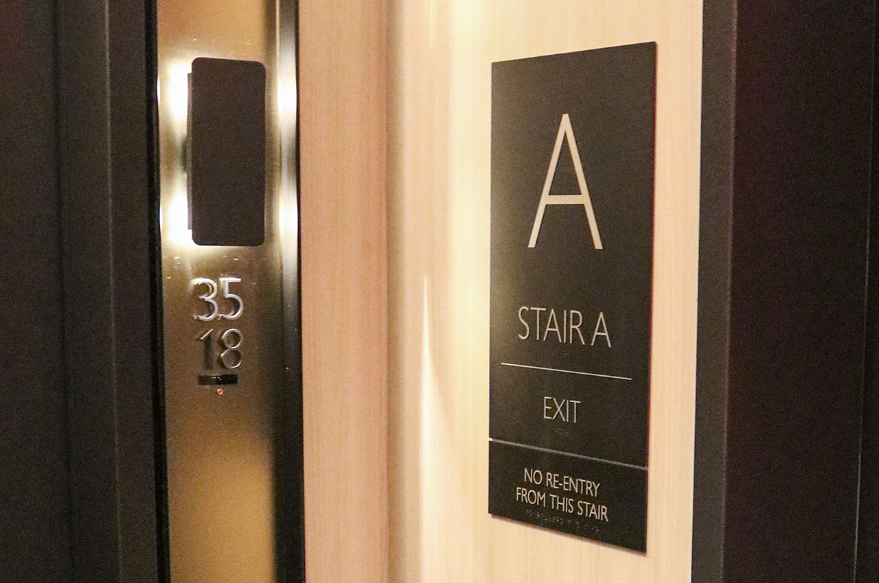
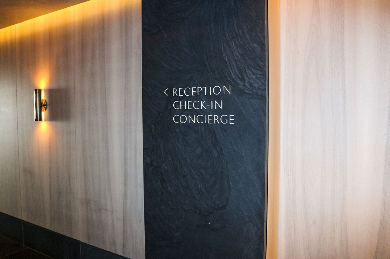
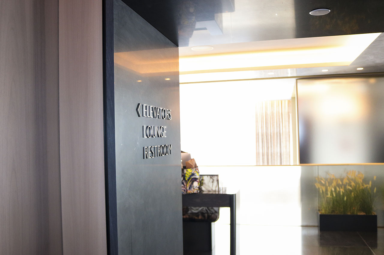
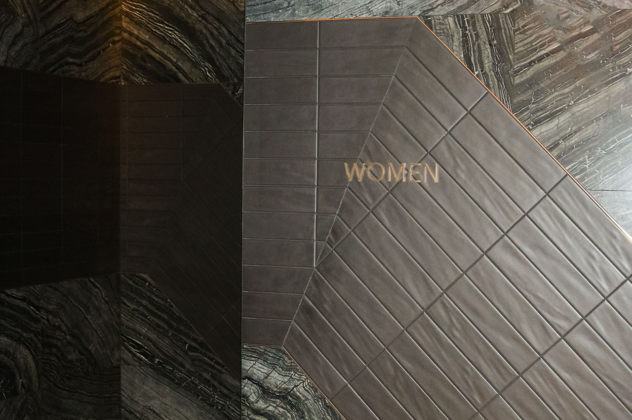
Designed for rejuvenation, the color palette and sign design for Equinox Hotel was “dark, quiet and cool.” The logo at the entrance required our extensive knowledge of fabrication in order to ‘float’ the top part of the “O” and ensure the large fabricated letters were structurally sound and matched the curve of the canopy. With many individual cut letters, our installation in the interiors had to be on point and accurately leveled.
SERVICES PROVIDED

